Pages

Wednesday, 29 June 2016

Swirly Bird Joseph's Coat Variation

This is another of my Joseph's Coat variations.  This time I used the Swirly Bird stamp set.

Stampin up, #thecraftythinker, Joseph's Coat Variation, Swirly Birds
Swirly Birds is such a versatile stamp set!
The greeting is from the stamps included with the Oh Happy Day Kit.  It actually says "Why Thank You".  Whilst we all know what that greeting is trying to convey, I do find it botheringly ambiguous - so I simply omit the word "why". 

To do that, I cover the "why" with some washi tape before I ink up the stamp and then remove the washi tape before I stamp.

Stampin up Australia, #thecraftythinker, Joseph's Coat Variation, Swirly Birds
I added sequins and Basic Rhinestones to the finished panel.

I decided to leave the centre of the card a little lighter, so I used Tempting Turquoise ink , blending it into the Dapper Denim that I used over the rest of the panel.  I added a light touch of Memento Tuxedo Black ink to the edges of the panel.
 
Dimensions:
Card:  Dapper Denim cut to 11 1/4" x 3 7/8" folded in half
Basic Black:  3 9/16" x 5 5/16"
Tempting Turquoise:  3 1/2" x 5 1/4"
Basic Black:  3 1/4" x 5"
Joseph's Coat panel:  3 1/8" x 4 3/4"

Joseph's Coat Variation Tutorial:


  • Wipe the entire Whisper White panel with an Embossing Panel to remove oils and static.
  • Using the striped sail shape, coat well with Versamark ink and then tap into Melon Mambo ink.  Stamp horizontally at the bottom of the panel.
  • Use a damp cloth to clean the stamp, dry it then repeat to create a border (always cleaning and drying the stamp before using the Versamark)
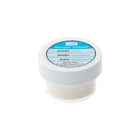
  • Sprinkle with clear embossing powder.
  • Repeat at the other end of the panel.
  • Use a similar process with one of the swirls, versamark and Tempting Turquoise ink.
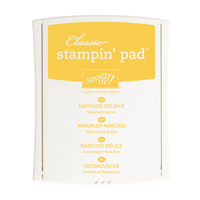
  • Repeat with the little flower, Versamark and Daffodil Delight ink.
  • Repeat with the ink splotch stamp, Versamark and Peakaboo Peach ink.
  • Use your heat tool.
  • Allow to cool for a minute or two.
  • Sponge over the top with Tempting Turquoise, Dapper Denim and Tuxedo Black ink
  • Use a tissue to remove the ink from the embossing.
 Tips and Tricks:
  • Keep to hand a damp cloth (to clean the stamps) and your clear embossing powder.
  • When using coloured ink, always clean and dry the stamps between uses so that you don't transfer ink to your Versamark ink pad.
  • I prefer to sprinkle the embossing powder soon after stamping the image, so I sprinkled the embossing powder before changing to a different stamp or colour.
  • Photopolymer stamps are the best for this process because you can see exactly where you're stamping.  The zig-zag stamp I used is rubber (one of the Clear stamp sets) so I used it first.  I personally would only use a photopolymer greeting because I wouldn't have the courage to try to line up a rubber greeting stamp without the use of a Stamp-A-Ma-Jig - which would not be feasible.
  • I didn't worry about overlapping the Peakaboo Ink Splotches over the Tempting Turquoise swirls.   
  •  
    'Til next time
    Stephanie
Product List - To shop in my online store, click on one of the product images below (Australian Residents only)

Monday, 27 June 2016

Joseph's Coat Variation

I had so much fun with the Joseph's Coat technique for yesterday's Blog Hop that I thought I'd take it a bit further.

Stampin Up, #thecraftythinker, Josephs Coat Variation technique, Mixed Borders, Perfectly Wrapped

I don't know if there's a name for this or even it it's actually a "thing" (well, if not, I guess it is now!) but I like to think of it as "Joseph's Coat for control freaks" (such as I)!  Ultimately, it's a type of emboss resist.

I have also included here a short video tutorial.


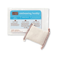
  • The centre panel started life as a piece of Whisper White cardstock.  I rubbed it with my Embossing Buddy before I started - I think that step is quite important in order to control the embossing powder.
  • Using the zig-zag stamp from Work of Art, I inked it well with Versamark and then tapped it into Tempting Turquoise ink before stamping onto one end of my white panel.  I then immediately sprinked it with clear embossing powder.
  • I then wiped my stamp clean with a damp cloth, dried it (with my hand!) and repeated the process at the other end of the panel.
  •  I then used the greeting from Mixed Borders but only used Versamark before sprinkling with the clear embosing powder. 
  • The next step was the circle of dots from Perfectly Wrapped, again just using Versamark and clear embossing powder.
  • Then I used the large solid flower from Perfectly Wrapped, coated it with Versamark and then tapped it into Peakaboo Peach ink, stamped it on my panel and sprinkled with clear embossing powder.  I reapeated this twice so that I had three Peakaboo Peach flowers.
  • Using the small solid flower from Perfectly Wrapped, I used Versamark then Sweet Sugarplum before stamping and adding embossing powder.  I stamped five of these.
  • Next was the small flower (or star) outline from Perfectly Wrapped, for which I used Versamark and Daffodil Delight ink before adding the embossing powder.
  • Lastly I used the dots from the No Bones About It stamp set with just Versamark before applying the embossing powder.
  • After using the heat tool and allowing it to cool for a minute or two, I sponged with Dapper Denim ink and then used a tissue to wipe the ink from the heat embossing.
  • I added White Perfect Accents to the centres of the Peakaboo Peak flowers and Rhinestones to the centres of the smaller flowers.  
  • I wrapped some Solid Bakers Twine around the bottom of the panel (it was Whisper White twine that I died Peakaboo Peach) and then finished the card layers.
Layer Dimensions:
  • Main card:  Sweet Sugarplum.  Cut a 4.25" wide piece from an A4 sheet.  Fold in half to produce a card that is 4.25" by just under 6" (5 7/8 to be exact!).
  • Whisper White:  3 1/2" x 5 1/8"
  • Dapper Denim:  3 3/8" x 5"
  • Josheph's Coat panel:  3 1/8" x 4 3/4" 
Stampin Up, #thecraftythinker, Josephs Coat Variation technique, Mixed Borders, Perfectly Wrapped
This is the card I made with the panel from the video tutorial.  The colours are Flirty Flamingo & Peakaboo Peach
 Tips and tricks:
  • Keep to hand a damp cloth (to clean the stamps) and your clear embossing powder.
  • When using coloured ink, always clean and dry the stamps between uses so that you don't transfer ink to your Versamark ink pad.
  • I prefer to sprinkle the embossing powder soon after stamping the image, so I sprinkled the embossing powder before changing to a different stamp or colour.
  • Photopolymer stamps are the best for this process because you can see exactly where you're stamping.  The zig-zag stamp I used is rubber (one of the Clear stamp sets) so I used it first.  I personally would only use a photopolymer greeting because I wouldn't have the courage to try to line up a rubber greeting stamp without the use of a Stamp-A-Ma-Jig - which would not be feasible.
Stampin Up, #thecraftythinker, Josephs Coat Variation technique, Mixed Borders, Perfectly Wrapped
The Botanical Builder adds more depth and movement and softens the layers

'Til next time
Stephanie

Product List - To shop in my online store, click on one of the product images below (Australian Residents only)

Sunday, 26 June 2016

Crazy Crafters June Blog Hop - Joseph's Coat


Welcome to the Crazy Crafters Blog Hop with our Special Guest stamper, France Martin (perhaps better known as Frenchie!) - we are thrilled to have her join us this month and so excited to CASE (Copy And Selectively Edit) any project that has been created by her. We hope you find great inspiration from the projects.

Whether you are starting the blog hop here at my blog, Stephanie Fischer - The Crafty Thinker, or have come from the person before me, be sure to click on the person listed under me further down the page to continue your journey on this blog hop.

http://www.frenchiestamps.com/2016/04/joseph-coat-watercolor.html
Click this image to go to
France Martin's blog
I have been enjoying and learning from the Frenchie tutorials for several years - especially the videos (who doesn't love that gorgeous accent!) so this opportunity has been very exciting for me.  But it did pose a problem when selecting a project to CASE - there are just so many that I love!  

Eventually I decided to opt for something that I hadn't done before and chose the Joseph's Coat technique (I assume named after Joseph's Coat of many colours).  France has a great tutorial over on her blog - just click on the image of her card, to the left, to follow the link.

Stampin up, #thecrafty thinker, joseph's coat technique, #crazycraftersbloghop, Bloomin Love
Joseph's Coat technique with the Bloomin' Love stamp

Since it was my first attempt at this technique - I kept it simple and used only two stamps - the heart from Bloomin' Love and the greeting is from the Hostess set Time of Year.  

Unlike France, I sponged the colours onto Shimmery White cardstock with a sponge dauber.  My first plan was to place the colours randomly but, as you can see, I don't do random very well!  I ended up sponging diagonal stripes in Peakaboo Peach, Bermuda Bay and Watermelon Wonder.

I made sure the ink was dry before giving it a quick wipe with my embossing buddy and then stamping with Versamark and clear heat embossing.

Once the heat embossing had had a couple of minutes to cool, I sponged over the entire project quite heavily with black ink and then used a tissue to wipe the ink off the heat embossing to reveal the pretty colours.  From my personal (and painful) experience, allow me to give you a tip:  use Memento Black ink.   On my first piece, I made the mistake of using Basic Black Archival ink and was unable to properly clean it off the embossing!

I layered my Joseph's Coat panel onto Watermelon Wonder and then Basic Black cardstock before placing it onto the front of my Bermuda Bay card.

I really enjoyed this technique (although I ended up with very inky fingers!) and I know I'll be doing it again very soon.  Thank you again France Martin for your wonderful inspiration!

I hope you've enjoyed this card and I welcome your comments. 
Thanks for taking part in our blog hop. Remember that currently you are at my blog - Stephanie Fischer - so click on the next name in the list to ensure that you don't miss out of seeing any of the blogs and the amazing inspiration they contain.

'Til next time.
Stephanie
 
Product List - To shop in my online store - click on one of the product images below (Australian Residents only)

Friday, 24 June 2016

Mondrian inspired card set

This project is entered into this week's Crazy Crafters Project Highlights.  Click here to see the other great projects and vote for your favourites.

I was first introduced to the work of Piet Mondrian while studying History of Art .... a long time ago now!  It had immediate appeal for me which has grown, rather than diminished, with the years.

In making a set of cards as a gift, I turned to Mondrian for inspiration ... and I think he came up trumps!


I started out with Composition with Red, Blue and Yellow (he painted it in 1930 but it's still fresh and appealing today) because there were more bold blocks of colour than lines.  I added a couple of stamped greetings because the large blocks seemed to require it.
Stampin' Up, #thecraftythinker, Gift Card Set, Mondrian, Swirly Scribbles, Painter's Palette
The greetings are (appropriately) from the stamp set Painter's Palette

I then felt ready to try my hand at some of the more intricate pieces, starting with 
Composition with Red, Yellow, Blue and Black (one of his 1921 pieces). 

Stampin' Up, #thecraftythinker, Gift Card Set, Mondrian, Swirly Scribbles, Painter's Palette
I first cut and positioned the black horizontal and vertical lines then added the rectangles of colour

To suit the medium of cardmaking and my abilities, I had to make some adjustments to the designs but I hope I have managed to maintain the balance that is so important in his designs.

The next card is based on Mondrian's Composition with Red, Yellow and Blue (painted in 1921)
Stampin' Up, #thecraftythinker, Gift Card Set, Mondrian, Swirly Scribbles, Painter's Palette
I cut and glued the lines first then trimmed and adhered the coloured cardstock

All of this was inevitably and inexorably leading me back to present day Stampin' Up! and the wonderful new Swirly Scribbles thinlits!  

Stampin' Up, #thecraftythinker, Gift Card Set, Mondrian, Swirly Scribbles, Painter's Palette
The Swirly Scribbles thinlits are perfect for a Mondrian inspired design
 
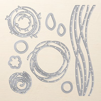
I cut the Swirly Scribbles several times in Basic Black and adhered them to a piece of Whisper White cardstock in a design that I found pleasing.  Then I used the same die with Real Red, Daffodil Delight and Pacific Point cardstock.  After adhering the pieces that I wanted to complete my design, I kept the rest for later projects.

I like the card case so much, I'm going to make a card version of it!

Stampin' Up, #thecraftythinker, Gift Card Set, Mondrian, Swirly Scribbles, Painter's Palette
I used the easel and greeting from the Painter's Palette stamp set to cover the join in the Swirly Scribbles!
Thank you for visiting, I hope you enjoyed this card set.  This project is entered into the International Blog Highlight - do visit it to see the other great projects and vote for your favourites. 

'Til next time
Stephanie


Product List - To shop in my online store, click on one of the product images below (Australian Residents only)