Pages

Monday, 29 February 2016

A word of thanks


JAI #300
I have never tried any of the Just Add Ink challenges and have decided it's time to change that situation!

Click on the challenge picture to the left to go to the Just Add Ink site, look at the other entries and maybe you'd like to try the challenge too.

It's the 300th challenge - so it's a pretty special one!

SU, A world of thanks, masculine card, thank you card, #thecraftythinker.com.au
The embellishments don't seem to detract too much from the overall masculinity of the card

I have made this card to enter into the Just Add Ink challenge this week.

The layers are Island Indigo, Hello Honey and a piece from the Going Places DSP Stack.

I cut a couple of little banners from Bermuda Bay cardstock and pinned them together with an Antique Brad.

I stamped the A World of Thanks image onto Whisper White using Bermuda Bay ink.  Then lightly sponged with Pool Party ink.  I highlighted the "thanks so much" wording with gold Wink of Stella and cut out a section with the Circles Collection framelits, using the next size up to cut a Hello Honey mat.

The final touches were the Basic Black Stitched Satin ribbon and a piece of Bermuda Bay ribbon from my stash (that I think may now be retired).

Despite the bow, I think it still retains a sufficient air of masculinity to make it suitable for anyone.

'Til next time
Stephanie

To make a purchase, click on any of the images below.
Product List

Sunday, 28 February 2016

Best Thoughts - yes.... another Monochrome!

SU, #thecraftythinker, Monochrome watercolour, Best Thoughts, handmade card
I really wish I hadn't used the black on the greeting
SU, #thecraftythinker, Monochrome watercolour, Best Thoughts, handmade card
Well, my love affair with the monochrome continues!  There is something in this card that's making me really kick myself though!  Can you spot it?

I like to use a Stamp-a-ma-jig to help me position elements in my cards - especially wording (although sometimes I use it just to test if a combination or placement is going to work).  I generally use black ink for this (except if I'm using black card stock!) so that it shows clearly.

I didn't pay attention and used the black ink on my card instead of the Pacific Point that I had intended!

Other things went a bit awry too!  I originally had the painted panel mounted on some DSP but didn't like it.  So I just trimmed around the panel and layered it into this simple design.  The decorative panel now has quite a bit of thickness to it and so it sits quite proud - I quite like that.

It was only after I'd taken some photographs that I realised that I had forgotten to add back in the detail of the stamens to the flower.  Fortunately, that was easily corrected with a few lines and dots with a Pacific Point marker and white gel pen.

I think that's the end of my confession!

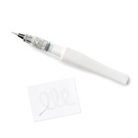
I gave the butterfly's wings a thorough coat of clear Wink of Stella and then decided to add a touch here and there on the flower.

I used Island Indigo cardstock and Pacific Point ink for the decorative panel.  This was layered with Soft Sky and more Island Indigo cardstock.

I found the Island Indigo card much more difficult to work with than the Perfect Plum I used in this project.  I'm not entirely sure why.  One thing that has occurred to me is that the Elegant Eggplant ink is very well pigmented and worked perfectly with the Perfect Plum cardstock to provide the necessary depth of shadow.  Perhaps I should have tried the Island Indigo ink.  I tested out Night of Navy as well as the Pacific Point and preferred the latter.

SU, #thecraftythinker, Monochrome watercolour tutorial, Best Thoughts, handmade card
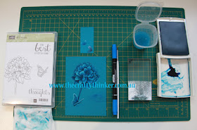
This photo shows my colour tests and gives an idea of how I work.
As you can see, I used a fairly fine brush for this card.  I knew I wouldn't need a lot of white ink, so I just put some on an acrylic block (as you can see - I still overestimated!).  I put a few drops of reinker into the lid of the Pacific Point ink pad and used that as my palette.  I can control the depth of colour I apply by taking the ink directly from the pool of ink or from the "swished" ink.  

I was careful to use as little water as possible to maintain the integrity of the cardstock (unlike watercolour paper or Shimmery White Cardstock, this cardstock is not created to withstand the stress of water).  I had my absorbent paper on hand to remove excess water but ... try as I might to stay clean - I really like to judge how much water is in my brush by feeling it with my fingers.  
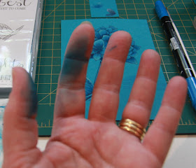
SU, #thecraftythinker, Monochrome watercolour tutorial, Best Thoughts, handmade card
It takes a while to come clean!  Meantime, I wear my creative mark with pride!
SU, #thecraftythinker, Monochrome watercolour tutorial, Best Thoughts, handmade card
Almost finished!

As you can see from the photo above, I added the sentiment at the very end - once I'd decided how to finish the card and trimmed the piece as necessary.

You can also see that I added a Pacific Point marker to my tools because it helped me overcome the difficulty I was having getting strong enough darks.  I used the pen end of the marker and feathered in strokes of ink where necessary.  If necessary, I then blended it out with my brush and a little bit of ink.

I hope you like the card and the descriptions may prove useful to you.  I'm still awaiting the arrival of the piece I've ordered to connect my phone to a tripod - then I'll try to do a video.

'Til next time
Stephanie

Tips & tricks
  • I stamped the image on the Island Indigo cardstock using Island Indigo ink.
  • I minimised the water as much as possible - in places I was using a "dry brush" technique.
  • I worked in a scattered way around the piece, allowing areas to dry before working on an adjacent area.
  • As areas dried, I could see the true tones and whether it needed another layer of colour
  • I used the marker to add the deepest tones.
  • I tried to keep the strongest contrasts in tone at the front of the flower.
  • The white gel pen that I used for the tips of the stamens (you can tell I'm no botanist!) was a bit too bright, so I dabbed the white dots with the writing end of the Pacific Point marker to tone them down a bit.
Click on an image below to order a product from my store
Product List

Friday, 26 February 2016

Black & White coastal scene with lighthouse

SU, From Land to Sea, the open sea, black & white card, sponging, masking
A precious cargo is guided into the safe haven at the end of its journey
I've struggled over whether to share this one or not.  Eventually, though, I came to the conclusion that when we share our projects via our blog posts, we are also sharing a little something of ourselves and our lives.  And life isn't always flowers and sunshine, unfortunately.

Today (as I write this), I received the news that someone very dear to me has taken her last breath.  This card is for her family.

For me, this picture represents a precious cargo being guided into a safe haven at the end of its journey.  

Thanks for visiting me today.
'Til next time
Stephanie

Tips & tricks:
  • I stamped the lighthouse & ship with black into onto Very Vanilla cardstock & masked them.
  • I tore a piece of scrap paper to produce something like a cliff edge and used it as a mask while I sponged with black ink.  I used Mememto Tuxedo Black as I think it's a bit of a softer, warmer black.
  • I tore another piece of scrap paper to create a mask for the mountains and used a straight edge of paper to mask the sea while I sponged the mountains with black ink.
  • I then, very lightly, sponged black onto the sky area, using the straight edge of a scrap of paper as a mask to create the beam of light from the lighthouse.
  • I reversed my "mountain" mask and sponged the mountain reflection into the sea area.
  • Then I lightly sponged all of the sea area.
  • The ship stamp has built in waves which I needed to incorporate into my scene somehow.  So I used a small brush and watercoloured in swirls of black ink until it seemed blended enough.
  • I removed the masks from the lighthouse & ship and gave them a very light touch of black ink to reduce the stark contrast a little.
  • I used the grass stamp from In the meadow to stamp with black in the foreground.


Product List

Wednesday, 24 February 2016

Beautiful Ride - moving card

SU, Beautiful Ride, Moving card, sponging and masking, partial stamping
The Beautiful Ride and In the meadow stamp sets were used for this card

This little car-d is intended to lift the flagging spirits of some elderly friends who have just moved!  The poor things are mentally and physically exhausted and full of aches and pains, so I chose yellow as the focal colour - I always think it's soothing and cheerful.

I stamped the car and luggage then masked them (having first removed the windows from the car mask) while I stamped the trees and shrubs then sponged the background.  The shrubs are created with the grass stamp from the In the meadow stamp set.

The road is sponged with Sahara Sand with shadows of a very light touch of black.  The sky is Marina Mist and the trees and shrubs a mix of Pear Pizzazz and Mossy Meadow.

Having removed the masks, I edged the road with Basic Gray and Basic Black markers.  I coloured the car with Daffodil Delight and Crushed Curry markers.  I used Basic Black, Basic Gray and Smoky Slate markers on the wheels.  I added a little bit of Basic Black marker on the road under the tyres to "ground" the car.

I coloured the tree trunks with Crumb cake and Chocolate Chip markers and added a few dots and strokes of Real Red marker to create some flowers.

The luggage is coloured with Sahara Sand and Basic Black markers.

I stamped the sentiment "Congratulations you two"  and then added the "'ve moved" by partially inking the "We've moved" greeting.  To ensure that it all looked even, I also inked the first sentiment with the Basic Black marker.

Thanks for visiting.

'Til next time
Stephanie

Click on any of the images below to shop in my online store

Product List